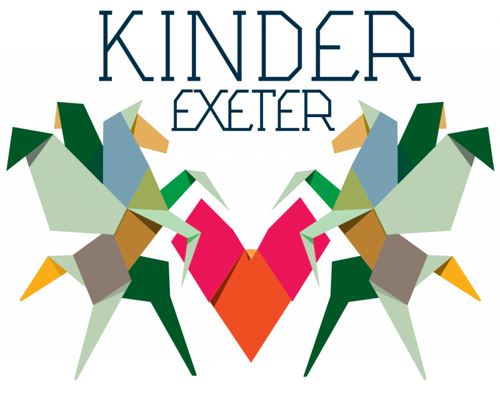
Creating a logo is a favourite task for most designers – to rough out an initial concept
all you need is an idea, a pencil and a layout-pad. At this initial stage computer software would simply stifle the natural flow of the concept from mind to paper … but later in the process it’s essential in fine-tuning a design and experimenting with fonts and a variety of colourways.
It is the responsibility of a good to designer to ensure that a chosen design works across all media, materials and applications, both in mono and colour.
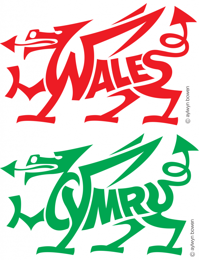
I’m fortunate in having designed several hundred logos during my career. Many look as fresh today as they did when first conceived. A good logo should be timeless, one that avoids current fashions and relates faithfully to the subject it represents. I strongly advise clients commissioning a new logo to avoid the temptation of embarking on a complete rebranding – normally, a good established logo can be modernised with an imaginative tweak. An excellent example of this is the ‘Shell’ company logo – in its original form it was simply the image of a shell. Similarly, the ‘Ford’ logo remains in its original form, modernised only in the materials used in its reproduction.
It’s the responsibility of a good designer to ensure that a logo works effectively in both mono and colour, across the media, and in all materials and applications.